Ok where do I start with this project? it was such a big project!
So this project started out with having the idea to brand a restaurant, we started out trying to do an indian restaurant but just wasn’t satisfied with any concepts we came up with, so we decide to brainstorm a few other restaurant ideas and a sushi bar came out on top.
We played around with a few name ideas and the number 8 came out to be the best name. We played round with a few ideas for this name, we decided to go with ‘no.8’
image here!
After we had come up with a logo we showed some tutors who told us that it looked like we were trying to say no to sushi so we had to have a rethink of how we were going to do this logo in the end we came up with lucky 8 instead it still had the same feel as before but read a lot easier. We also had a problem with A, as we have used chopsticks and a bar to represent the A, one tutor told us that it looked like a woman’s legs apart with her knickers down, I couldn’t see it personally but we didn’t want to give off the wrong impression and changed it immediately.
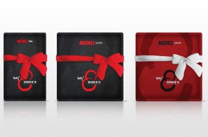
We came up with several visuals for this project, everything from menus to uniforms and the restaurant exterior to the restaurant interior.
Overall im very pleased with the outcomes of this project I feel they are very strong and will look great in my portfolio, this is by far one of my strongest projects to date.


Leave a comment